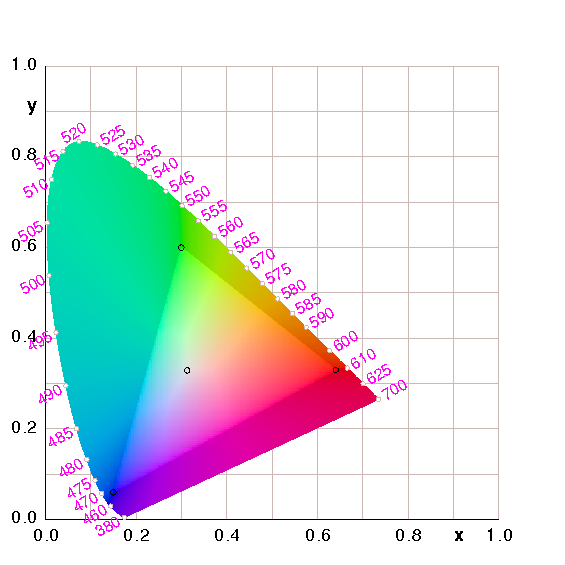
Figure 1: CIE Chromaticity Diagram
You have probably seen CIE chromaticity diagrams, such as in figure 1, figure 2, and figure 2. See e.g. reference 1.
A point in the xy plane can represent any possible color, (i.e. chromaticity value) without regard to brightness (luminance). Let’s start by looking at some examples, then circle back and figure out what it all means. This includes throwing around some terminology that will be explained soon, in section 2.
The horseshoe-shaped boundary corresponds to pure colors, i.e. monochromatic light, i.e. light of a single definite wavelength. Colors in the interior can be formed by mixing two or more lights with different wavelengths. The highlighted triangular region represents the gamut of a typical RGB monitor. Colors outside this region are not rendered faithfully in this document, so you will have to use your imagination. Beware. The corners of the triangle are the sRGB primaries (red, green, and blue). Anything in the sRGB color space can be formed by combining these primaries.
Figure 2 is another version of the same diagram, showing only the pure colors and the sRGB gamut.
Figure 3 shows the same thing again, with some additional detail. It shows the path from each of the sRGB secondaries (cyan, magenta, and yellow) to the white point.
Chromaticity diagrams of this kind don’t tell the whole story. The xy plot is just a top-down two-dimensional projection of the three-dimensional xyY space.
A side view of the xyY space is shown in figure 4. In this plot, the x axis is shown in very dark red, the y axis is shown in very dark green, and the Y axis is shown in white.
The Y axis corresponds to luminance i.e. brightness. The pure colors on the horseshoe all have equal photometric intensity (physics). They do not have equal perceived brightness (biology), because the sensitivity of the human eye varies with wavelength. Indeed the sensitivity is essentially zero for the the very-short and very-long wavelengths at the ends of the spectrum.
For the moment, let’s focus on the sRGB part of the figure (i.e. not the horseshoe). We are looking at 9 of the 12 edges of the sRGB cube, and 7 of the 8 corners (red, blue, green; cyan, magenta, yellow; white).
| Mouse-Drag | : | Rotate |
| Ctrl-Mouse-Drag | : | Pan |
| Alt-Mouse-Drag | : | Zoom |
| r | : | Reset view |
You see that the human eye is much more sensitive to green than to red or blue. So green is high up in the xyY space, and the neighboring secondaries (cyan and yellow) are higher still.
Magenta is higher than either red or blue, since it is the sum of the two, but even so it’s much lower than yellow, green, or cyan.
It’s remarkable that paths that are linear in the xy plane are the projection of paths that are wildly nonlinlear in the xyY space.
Among other things, the xyY color space flunks the telephone test, since y is pronounced the same as Y.
| (1) |
Since x+y+z=1, guaranteed, you only need two of them. It is conventional to keep x and y, as we see in figure 1, figure 2, and figure 2.
To say the same thing another way: x and y scale like N to the zeroth power, while Y scales like N to the first power.
If you want a perceptual color space, you can use CIELAB or CIECAM02. The Munsell color solid, dating from the very early 1900s, is also in this category.
In particular, it does not apply to light falling on pigments. For example, if light with a spiky spectrum (such as from a low-pressure sodium vapor lamp) falls on paint or ink with a different spiky spectrum, you can get all sorts of weird results, depending on which spikes like up and which don’t.
The cones are useless in dim light (not sensitive enough). The rods are useless in bright light (too sensitive, completely saturated). The interesting thing is that there is an intermediate regime where all four receptors contribute something. In this regime you need four primary colors.
Just the reverse is true of sRGB: Every point in the sRGB cube corresponds to a perceptible color, but the converse does not hold. There are many perceptible colors outside the sRGB gamut.
For example, the green of a typical green laser pointer has a wavelength of 532 nm which is far outside the sRGB gamut. It corresponds to an XYZ vector of (0.18914, 0.88496, 0.03694) or some multiple thereof. That corresponds to an xy (chromaticity) vector of of (0.1702, 0.7965).
You can achieve a much wider gamut by using a greener green primary, perhaps something near 532 nm. This is readily achievable using LEDs. You can do even better using four LEDs. Just because the eye has three receptors doesn’t mean your display is limited to four primaries. In fact, the overlap between the response curves means it is impossible to do a good job with only three primaries.
For more on all this, see reference 2 and references therein.